10 Rules for Designing for Inclusivity & Equality
- Home Website Design 10 Rules for Designing for Inclusivity & Equality

Designing for inclusivity and equality is a core principle of many designers. You want to create something that puts people first and is intended to be for everyone.
With that guidance in mind, Inclusive Design Principles is a codified set of seven rules for inclusive design. Here, we’re going to look at those principles, plus three more, to help you design for inclusivity and equality.
Designing for inclusivity and equality takes forethought and conscious practice. Seeing things that aren’t part of your everyday circles can be hard. So learning more about how to approach this whole space is a great place to start.
Inclusive design ensures that products and services are accessible and usable by people with diverse abilities, backgrounds, and preferences. It promotes diversity and equality by removing barriers and ensuring everyone can participate and contribute.
What’s interesting is that inclusive design can actually encourage innovation by requiring designers to consider a broader range of users and their needs
Inclusive design is often accessible, although these terms mean two different things. It is usable for as many people as possible and includes tools that make the design easier to understand and manage for more people.
What’s interesting is that inclusive design can actually encourage innovation by requiring designers to consider a broader range of users and their needs. This can lead to new ideas and solutions that may not have been considered otherwise.
At the same time, it can reduce costs by avoiding the need for redesigns later. By considering accessibility and usability from the beginning, designers can avoid costly mistakes and ensure that products and services are usable from the outset.
Finally, inclusive design can help you meet and comply with legal requirements. We won’t get into specifics here, but you should always understand what rules could potentially govern design projects in your region.
Now on to the rules for designing for inclusivity and equality.

Your design should allow people to accomplish tasks in different ways that suit their abilities. This might be as common as a click or a tap doing the same thing or using alt text to ensure screen readers understand the content.
It starts with understanding your users and their needs. You’ll have to consider accessibility to ensure that your design is accessible to everyone, including people with disabilities. This may involve providing alternative navigation options, keyboard shortcuts, and other accessibility features.
The situational impact of a user can be interesting because your design has to work just as well for a new user as someone who’s visited hundreds of times. The same is true of users on computers versus phones or outside versus indoors.
Situational use is important for inclusivity because you don’t want to lose a user because they can’t see the design outside in the sun, for example. These small elements of design can have a big impact on how people feel about interacting with it.
Design elements with great situational impact include:
Color contrast for visibilitySound or captions for understandingContext cues to ensure interactions are understandable
Design patterns are your friend.
From Inclusive Design Principles: “Familiar interfaces borrow from well-established patterns. These should be used consistently within the interface to reinforce their meaning and purpose. This should be applied to functionality, behavior, editorial, and presentation. You should say the same things in the same way and users should be able to do the same things in the same way.”

Users like to be in control of the web experiences. And they should be able to interact in a way that works for them. Most of these design choices are things you might now even really think about but can have a significant impact.
The ability to control scrolling. Load more buttons provide more control and can often be more effective than infinite scrolling.Start and stop buttons for animation, sound, and video.Pinch and zoom features to better see content on smaller screens.Ability to log in or shop as a guest without an account.
Choice sometimes is easy – click or tap, play or not play, click a photo or button for the same link. By providing multiple options for the same interaction, you help users get the result they are looking for in a way that makes the most sense to them.
This inclusive principle can sometimes be the most difficult to understand because the way we design is often rooted in how we behave.
Think about these three examples from Inclusive Design Principles:
Where appropriate, provide multiple ways to complete an action. On mobile, swiping to delete an item can be supported with an edit button that allows you to select items and then delete them. In layouts where there are long lists of content, consider offering a grid or list layout option. This supports people who may want larger images on screen or smaller rows.Alternative ways of presenting data, such as data tables for infographics, should be available to all users as an option rather than a hidden link just for screen reader users. Accessible alternatives can benefit not just a specific target group but all users.

There’s a reason the phrase “content is king” gets repeated so much. It is because it is at the core of good design and user experience for all.
Extend the idea of content to tasks, features, and information comprehension to ensure that everything in the design has a clear path and user hierarchy. This creates greater user understanding and usability.
Are you adding tricks to the design or value-rich features? The line between the two can be fine, but from an inclusivity standpoint, value-rich features mean something, and tricks can stand in the way of usability and actually create roadblocks for users.
When considering a new feature for the design, ask yourself this: Does it make task completion or goal conversion easier for my user? If not, reconsider usage.

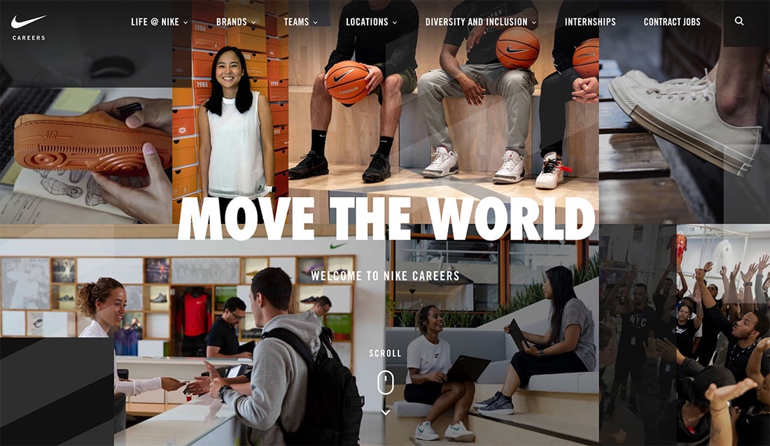
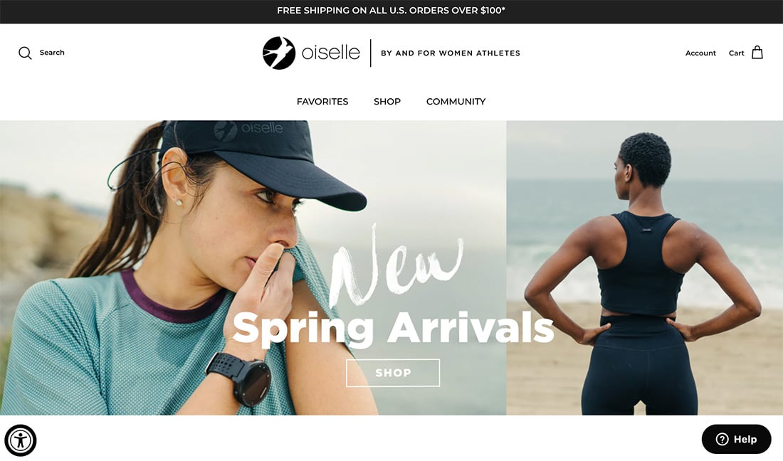
Inclusive and equitable design shows different people. This includes people who look different and have different abilities.
You have to do it in a way that does not tokenize difference. Avoid using stereotypes that can reinforce negative attitudes and beliefs about certain groups of people and ends up excluding, rather than including, them.
Use inclusive language that is welcoming and respectful to all users. Avoid language that is exclusive, insensitive, or offensive to certain groups of people.
Provide users with options that cater to different abilities, preferences, and needs. For example, provide alternative text for images, captions for videos, and audio descriptions.
Human bias creeps into everything we do; it’s almost unavoidable. Being aware of potential bias is the best way to combat it.
You need to be aware of your own potential biases when creating designs – do all the people in photos look like you? – and for your team. Creating a more diverse team with different backgrounds, ideas, and experiences can help nip biases early.
Finally, test your design with a diverse group of users to ensure that it is inclusive and meets everyone’s needs in the best way possible. This will help you identify any barriers or challenges that need to be addressed.
Use that information to improve your design continuously. User feedback is a primary factor when making adjustments to ensure that your design remains inclusive and meets the needs of all users.
Designing for inclusivity and equality takes forethought and conscious practice. Seeing things that aren’t part of your everyday circles can be hard.
To be a more inclusive designer, ask questions, gather feedback, and look to learn from people who don’t look at or use the web as you do. It will help you expand your design horizons and create better products.
By: Carrie Cousins
Title: 10 Rules for Designing for Inclusivity & Equality
Sourced From: designshack.net/articles/accessibility/designing-for-inclusivity-equality/
Published Date: Mon, 20 Mar 2023 10:00:42 +0000
Did you miss our previous article…
https://www.webdesignhawks.com/?p=23866