
Looking to knock your next presentation out of the park? Start with one of these design trends that will help you create a PowerPoint presentation with a lot of impact.
Here are some trending examples of current trends and techniques for delivering a modern presentation. From big, bold colors, to photo stories and big backgrounds. There’s no excuse for picking a standard design and delivering a stale, tired presentation anymore. Your audience expects more!
The best thing? If you like any of the examples here, you can download each one from Envato Elements!
1. Flowing Shapes

One way to make your PowerPoint presentation design stand out is to use flowing shapes. Too often, templates focus on all blocks and rectangles. With a set of flowing shapes, your presentation design will have an immediate impact.
When thinking about this style use a couple of different shapes and build on them. Ovals and circles are rather nice and partial shapes that extend off the screen and provide another option for these shapes with flow and movement.
Use shapes with a bright color or consider tints with a more subtle impact.
The trick to flowing shapes is to use them in such a way that they create visual flow toward text and other important messaging elements in the design. Plan accordingly!
2. Colorful Text Blocks
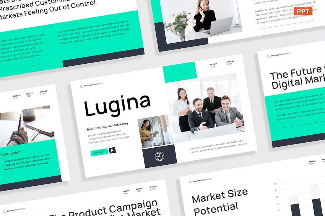
If you are working on a presentation design and don’t have a lot of great images, colorful text blocks can be a fun way to show information without feeling too bland.
There are a couple of ways to make this presentation design trend your own:
Use color for text blocks that’s part of your brand palette.Use colors that are unique to a specific theme or project.Include limited imagery with color blocks for additional interest.Make sure the color block and text element has high contrast and is easy to read.Use your brand font palette for an even more custom look and feel.
3. Dark Mode
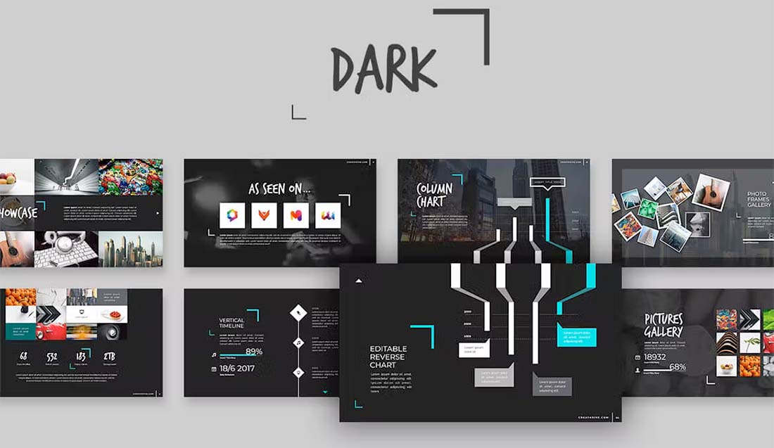
Dark mode isn’t just for website design. It’s one of those design trends that has crept into almost every facet of design, including presentations.
While this style looks very trendy and modern, it can present some challenges.
Reverse type can be difficult to read in some situations or lighting. Consider bumping up font sizes larger than you normally would. Don’t feel like dark has to mean black. Experiment with other dark color palettes for the base, such as purple or navy.
As long as the overall design has plenty of contrast and is readable, dark mode can be a fun and striking presentation design option.
4. Gray
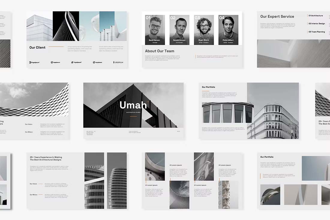
If dark mode is a little too dramatic for your PowerPoint presentations, consider an all-gray aesthetic. Gray has a calming feel, is visually pleasing, and is generally easy to read.
You can pair gray with colorful images or accents or go for a full-mode look, such as the example above, with black and white images and just a small hint of color.
This design scheme is trendy and quite elegant for presentations.
5. Image Overlays
There are generally mixed feelings about how to use images in presentation design. Some people love full-screen large image slides, while others argue that images can get in the way of messaging.
In the middle is this trend – use images with a color overlay. This allows plenty of room for images and text elements with a softer, more subtle feel.
Image overlays can also create a nice element of design and color consistency to help carry a presentation visually from start to finish.
6. High Color
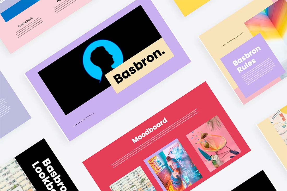
High-color designs have been popular for a while in other design arenas, and are bleeding over into presentation design now. This style has a very distinct feel with bold, bright, or even more pastel palettes with a lot of color.
It’s not for everyone or every type of presentation message.
But if you are looking for a lighter, more fun style, this presentation design trend can be a good place to start. Use your brand colors for maximum impact here.
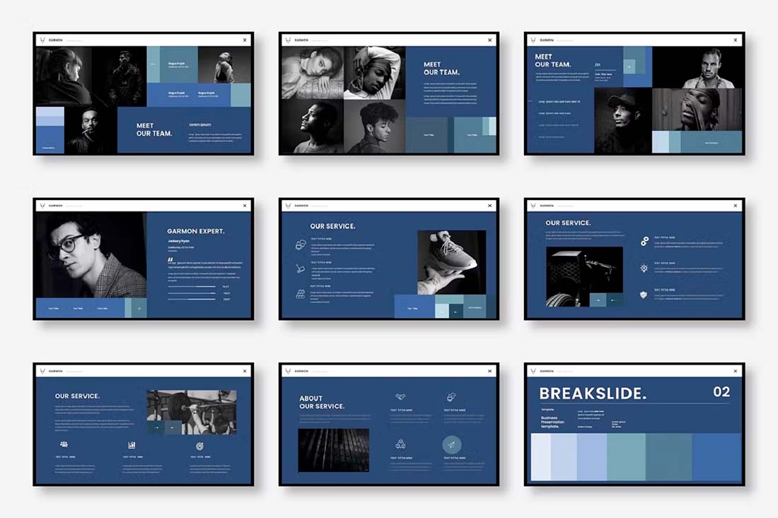
7. Minimal Monotone
On the other end of the high-color spectrum is choosing a monotone color palette for your presentation design. Monotone does not have to mean low color, but you are working with one predominant hue.
The teal choice in the example above is elegant and modern. It has a fresh feel that works nicely with the minimal outline of the rest of the design. Minimal aesthetics with monotone color palettes are the perfect compliments.
8. Muted Images
If you are looking to make an impact with the presentation design and want to try something totally different, consider muting the images so that they almost fade into the background.
This design style can be a great way to use imagery so that the words on each presentation slide are the true focus. Go a step further and use interesting shapes to direct the eye through slides using this trending style.
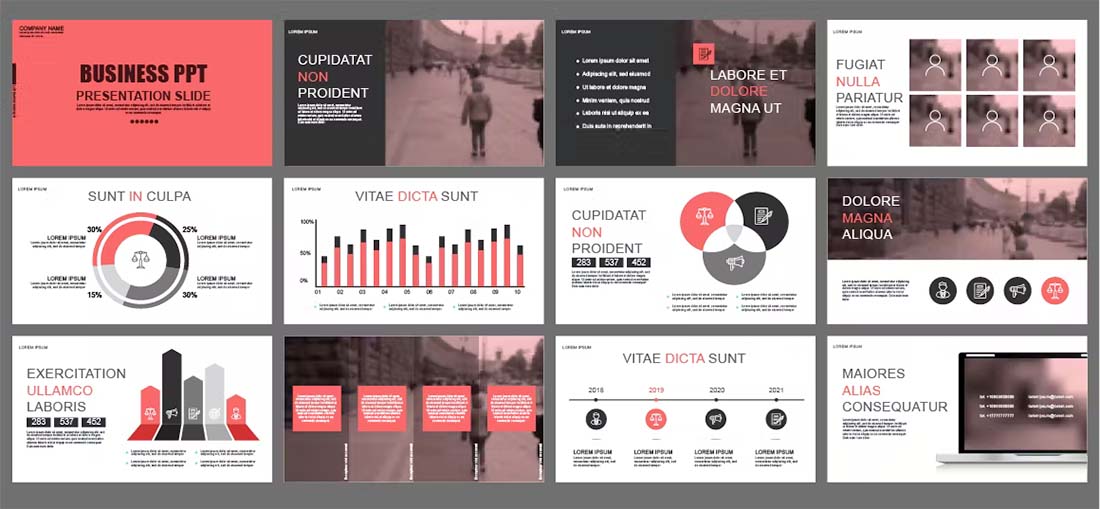
9. Blocky Design
If you want to go for a modern and trendy look and love the feel of geometric shapes, consider a blocky design. Using colored blocks, squares, or rectangles, you can create interesting shapes and configurations that make your PowerPoint presentation dazzle.
This is a true high-design style that can take a lot of effort and is best for smaller slide decks. It might also be easier to design if you start with a template, such as in the example above.
The blocky design style also works well with another trend already featured here – monotone color palettes. A single-color design helps hold all the pieces together for a unified presentation design.
10. Photo Stories
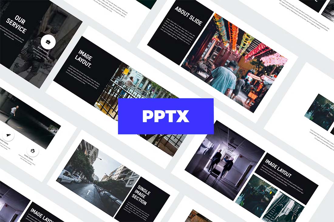
A presentation design that uses photos to tell stories is a highly engaging and trendy way to share information. To make the most of this presentation design style, create a template with big image areas that pair with simple text elements.
Keep it interesting with photos of different shapes, sizes, and placements in the design. By pairing text elements with image shapes and sizes, you can create a lot of visual interest with a unified style that does not look repetitious.
A photo story presentation design often doesn’t need a lot of other design elements to work beautifully. All ow images to tell your story and keep other design techniques – color, typography, graphics, and icons – to a minimum.
11. Big Backgrounds

It’s not something we are used to seeing regularly in PowerPoint presentation design – big, bold backgrounds that carry throughout. When done well, an interesting background can make up for a lack of other visual content to help propel a presentation design.
In the example above, the background is made from a simple color palette with blurred shapes. It’s bold and interesting but doesn’t overpower the overall design. That’s the trick to using a style such as this – create interest without overwhelming it.
12. Clean and Simple
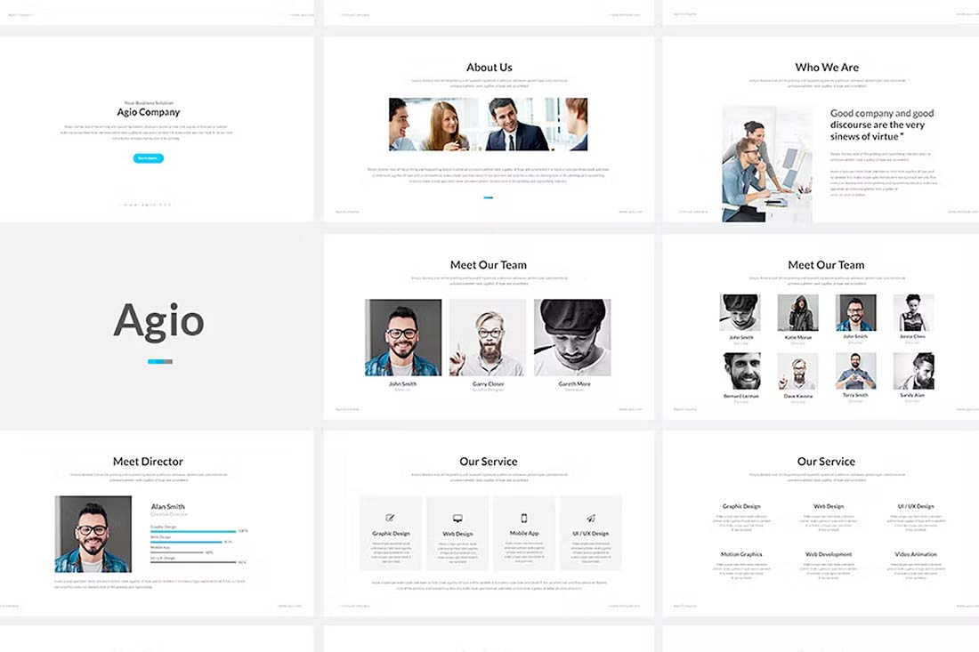
It seems a little weird to call this a trend because clean and simple are the most classic of design styles. But it’s trending because it always works. When in doubt, a simple design for a presentation can be just the ticket.
When creating a clean and simple design, think about developing reusable pieces that you can carry throughout the presentation, such as the shape of a photo or the color of a box. Stick to typefaces that further push this theme with a simple sans serif.
By: Carrie Cousins
Title: 12+ Presentation Design Trends for 2023: Create PowerPoint PPTs With Impact
Sourced From: designshack.net/articles/trends/presentation-design-trends/
Published Date: Mon, 21 Nov 2022 10:00:00 +0000
Did you miss our previous article…
https://www.webdesignhawks.com/?p=14033