

Have you noticed this trend in website design: layers on layers? I feel like I’ve been seeing more of it everywhere recently, and it’s a polarising one!
This is a design technique that can range from amazing in terms of visuals and usability to disastrous quickly. It’s clear that there’s a middle ground where it works, but it’s very easy to go too far!
Here, we’ll look at some ways to use it most effectively and a little more about what this design trend is about.
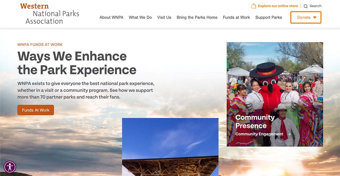
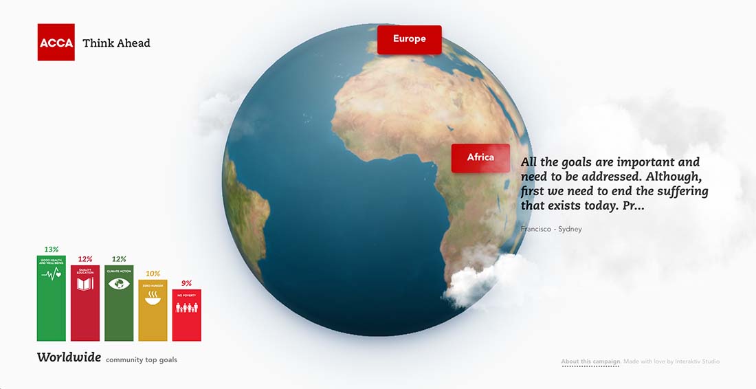
Websites featuring this trend include multiple layers that come together to tell a visual story. Layers are often interactive and include animated or scroll effects, but that is not always the case. (Sometimes these designs are static with a layered look.)
Three layers is the standard for most element here:
Background: Often an image, texture, or static layerMiddle ground: Often some type of image or interactive elementForeground: Often includes typography or imagery (the middle- and foreground layers sometimes work together (or inversely) to create the full design
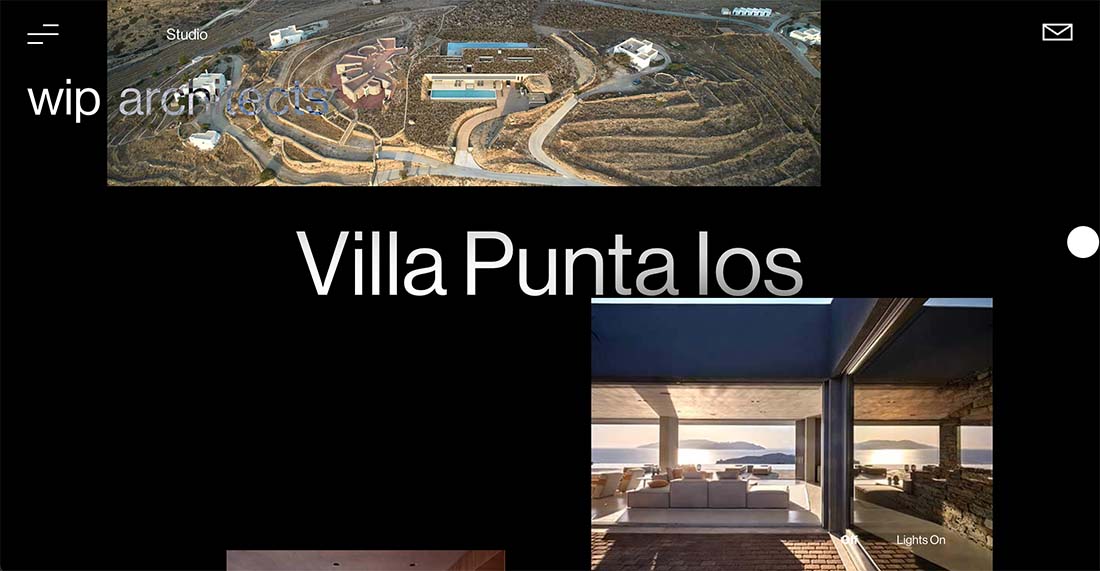
These designs tend to have a lot of moving parts – literally. Scroll actions often help bring layers to life so that you can see the differences in each and how they come together.
Scroll interactivity is a big part of these projects, whether is it helping elements work together or moving users through the design to find more layers of content. Not all of these projects feature this design trend obviously from the home page, sometimes it is below the scroll or even deeper in the website.
The trick to making it work well is pulling together design elements that feel harmonious. That includes everything from color to size to shape and scale. If layers don’t look like they should work together, it can create usability issues that could keep the design from being effective.
Another thing that you’ll notice about these projects is that many of them seem to feature a layer with a card-style element. This design technique has been popular for a while and continues to be with this trend.
The overall design of every website using this style and trend can be quite different because it has nothing to do with elements such as color or typography or imagery.
But each of those elements does have an impact. You’ll want to think about how to use them together to create a visual story that is engaging and makes the most of each layer.
The most important consideration when using this design trend is thinking about how layers will interact with each other. With scroll action or other motion, what does the element do? Ideally, you want the layers to interact in some way that feels and looks purposeful.
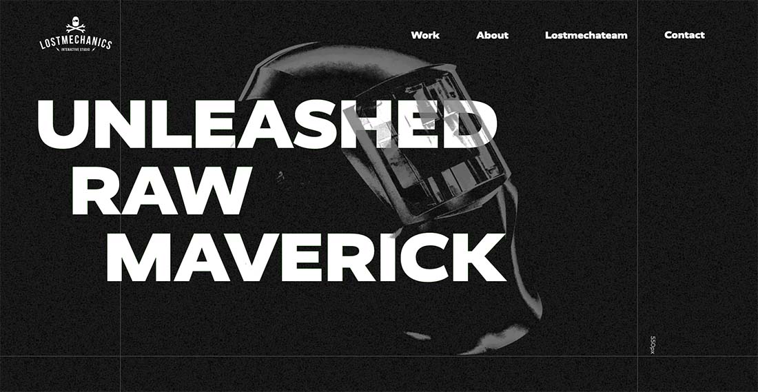
In the example above for Lost Mechanics Interactive Studio, there’s a black background layer, a text layer, an image layer that merges with the text layer, and a fourth glitch layer that’s on top of everything to finish this funky video effect.
The scroll includes other layers that stack on each other with text, images, and even card elements. While the design is busy, it works seamlessly and everything is easy to use and understand. Content is organized and this is a solid example of how to use multiple layers effectively.
Using this design trend takes care and planning. And pulling off a technique that’s effective isn’t necessarily easy.
Two key things to be aware of include:
How layers interact and overlapResponsiveness
These elements are closely related. Interactions need to be designed in such a way that even with layers, everything on the site is easy to understand and read. This is the biggest challenge with this design trend and one that’s a miss on many of the projects using it. Readability, in particular, becomes a concern for many of these projects.
Responsiveness is always a website design consideration, but once you get layers right at one size, they might not work the same way on others. Responsiveness can be quite tricky with so many (literal) moving parts.
There are some website designs doing a great job with this trend that provide inspiration for how to put these projects together.
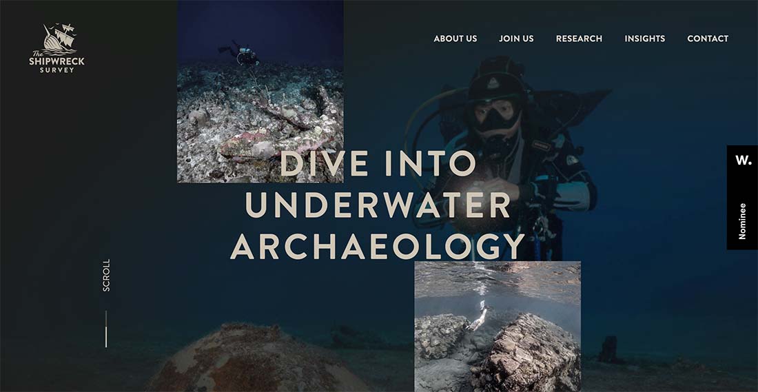
The Shipwreck Survey uses layers elegantly with a consistent color scheme and photo insets between a background image and foreground typography that add an extra layer of context. The designers continue using layers with image elements throughout the scroll to help pull the complete visual feel together. The other bonus here for the small images is that you get a greater feel for the adventure on this site, these small images are what sell it and the layered effect helped incorporate more of them into the design.
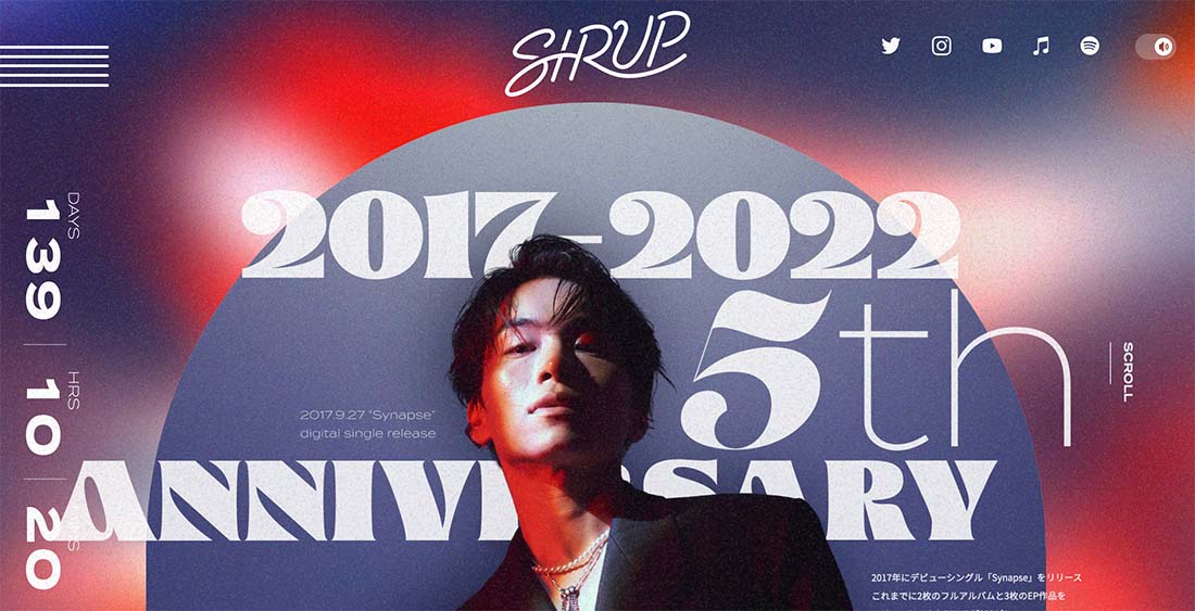
Sirup uses plenty of motion, funky fonts, an image, and even a video feel to put together a layered package that’s engaging and interesting. The scroll engagements are nice too, adding a three-dimensional feel to the main image. One of the best elements of layers here is a hint of transparency that pulls it all together.
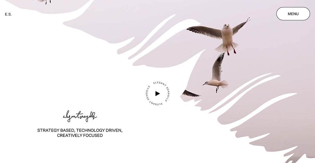
Elegant Seagulls uses multiple layers in a way that’s less in your face with a peek-a-boo effect. The background is a video reel of birds, the middle layer is the white solid splash element and there’s an interactive top later with the round call-to-action button that moves with the mouse. The video background effect is used in several locations of the design elegantly. (Also make sure to click through to the menu for a nice little design effect featuring cards there.)
While this design trend isn’t the easiest to pull off, it can be highly visual and interactive when done well. To make the best use of it, consider this design technique when you also have layers of content.
Matching content to design aesthetic is the best way to create a project that is just right for website visitors.
By: Carrie Cousins
Title: Design Trend: Almost Too Many Layers
Sourced From: designshack.net/articles/trends/almost-too-many-layers/
Published Date: Mon, 27 Jun 2022 14:00:31 +0000