A brand identity project starts with understanding the business, not with moodboards. We want to know who you serve, what you are actually like to work with, and how you want to be perceived.
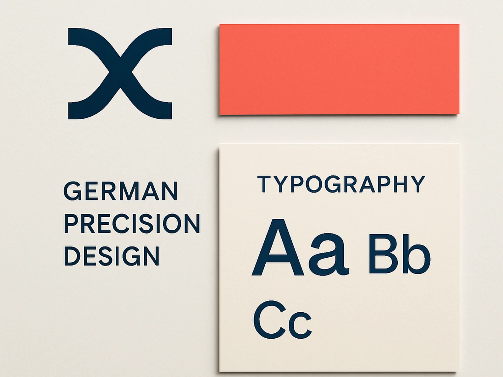
From that we develop a visual system: a primary logo, logo variants, a colour palette with proper usage rules, typography selection, and guidelines on how everything works together.
The brand guidelines document is the most important thing we produce. It is specific enough for your team to use independently: exact colour values, precise font sizes, rules on spacing and clear space.
German businesses have specific visual preferences that differ from other European markets. We understand that and factor it into the direction without making it generic.
What is included
What a client says
"We finally look like a practice worth the fees we charge. The new identity changed how clients perceive us from the first contact."