The 2023 Guide to Responsive Typography Sizing and Scales
- Home Website Design The 2023 Guide to Responsive Typography Sizing and Scales

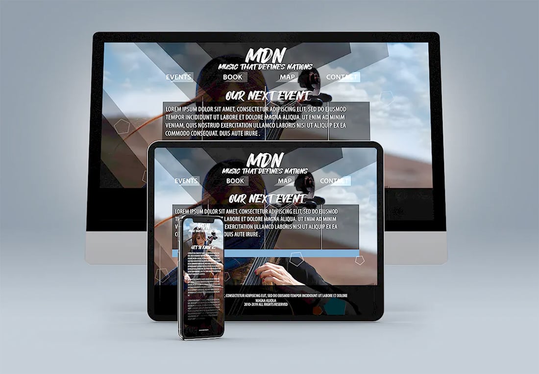
The true responsiveness of your website design is more than a framework that scales to each device, it also requires that typography adjusts to optimum readability as well.
Responsive typography will adjust so that text elements also change size and scale on websites. While that’s the technical answer, there’s also a greater design approach that is equally important, because just changing the size of a text element isn’t always enough.
Let’s dive into responsive typography best practices, a few guidelines, and some tools to help you create great type at any size.

A solid responsive typography plan will ensure that your content is readable across devices. It ensures that you have developed a set of rules for interaction, size, and scale that will help everything render across devices.
The good this is that for most websites, that’s pretty much down to two sizes: desktop and mobile. (Overall tablet usage for general web browsing has dropped dramatically in the past few years.)
A font and scale that looks great on a wide screen may not render well on a vertically-oriented handheld screen size.
Now here’s the challenge. A font and scale that looks great on a wide screen may not render well on a vertically-oriented handheld screen size. That can dictate your font choices and how you plan the website. (Otherwise, you may need to switch typefaces between desktop and mobile, which is not recommended.)
As you are planning the design, it is important to think about typographic elements as part of this overall framework so that you don’t get caught with an odd responsive typography challenge later. (Super wide fonts, for example, can present unique readability challenges on mobile screens.)
Responsive typography design considerations include:
Typography selection: Start with a font that looks great and reads well on a small screen first. Then test it on a larger screen.Limit type options: A smaller palette is easier to manage and is less weighty when it comes to load times.Consider a fallback just in case: If your desired font won’t load (maybe the device doesn’t like it or the CDN server is down), allow for an alternate selection that’s super common. (Arial is a popular fallback choice for sans serif typefaces.)Design size and scale based on content: Readable typography can depend as much on other content as font selection. The scale and sizes of text elements are often different depending on how much text is rendered at one time and the type of content on the screen.Take care with line-height: A little extra space between lines can enhance readability on mobile devices. There’s a delicate balance between too much and too little space. For smaller sizes a line-height of 150% or 1.5em can be a good place to start.Font category: Designers have really opened up to using more font variations – serifs, experimental, etc. – as a general practice. These can present some challenges when small or on screens where users might use dark mode more predominantly. Test type choices early to ensure readability if you go this route.

Most designers avoid working in absolute numerical units and prefer percentages or ems and rems.
Creating type for responsive designs requires a lot of thought about sizing and scale. Every designer may have a different opinion on what type of size unit they want to use.
The most popular size units include:
Pixels: Common notation for digital font size that notes an absolute numberPoints: More of a carryover from print for sizing that’s less common onlineEms: Sizing relative to parent font sizeRems: Sizing that inherits root stylingPercentage: Sizing based on percent change from a parent style
Most designers avoid working in absolute numerical units and prefer percentages or ems and rems. Using this model, you start with a base size (such as body text) and adjust sizing from there.
It can make the math easier (1rem is about 10px) and allows for a full-scale adjustment just by changing the default font size.
What does this look like for the default size?
Body text is generally 16px to 18px or 1.6rem to 1.8 rem (14px to 16px for mobile). Then you can use the scale you like to size everything accordingly.
If you size your body text or other default font size for desktop and mobile, the scale will take care of the rest.

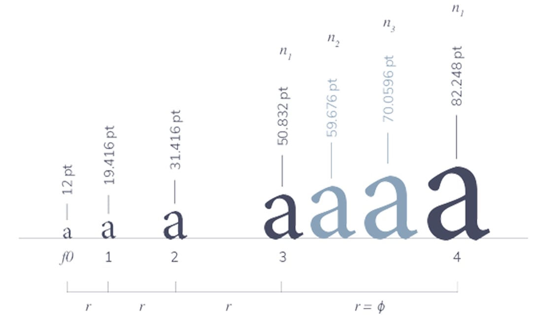
The type scale determines how much bigger or smaller fonts go rooted in the base or default font. Using this method your base size is 100% if you like percents or 1em, if that’s your preferred unit.
Then pick the scale and how that scale pertains to CSS positions from H1 to H6 and so on.
There are a few common typography scales that create distinct feels and harmonies that are a lot easier to calculate mathematically than randomly assigning values to type sizes.
Great for large screens, these scales have a lot of variation between sizes. The H1 and body text base will create a lot of drama due to the differences in size.
These scales include (number is change ratio):
Augmented Fourth, 1.414Perfect Fifth, 1.500Golden Ratio, 1.618
This is where most type scales fall and is a safe area for most screen sizes. It’s great for designs with a lot of text content.
These scales include:
Minor Third, 1.200Major Third, 1.250Perfect Fourth, 1.333
The least variable of scales is best for smaller type elements that are used as identifiers. You might see this type of scale with dashboard-based apps, e-commerce listings, or grid-based elements.
These scales include:
Minor Second, 1.067Major Second, 1.125
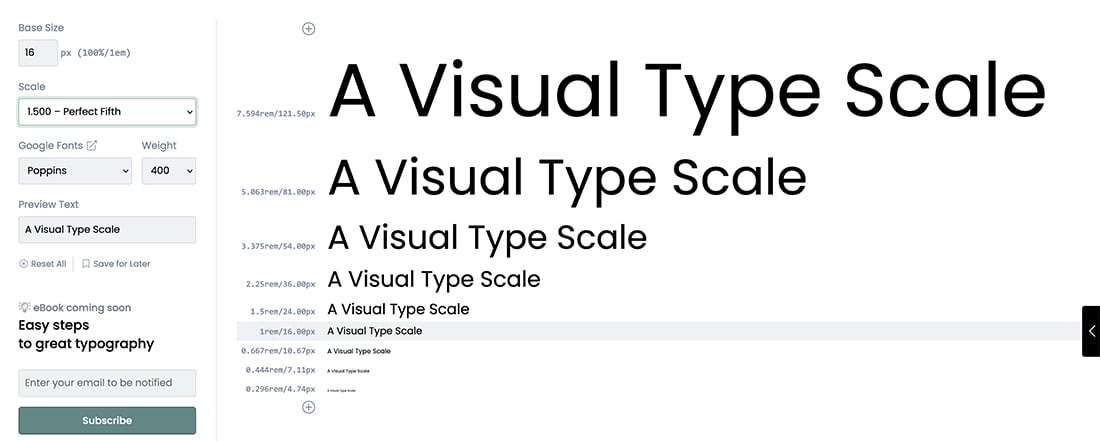
When it comes to creating typography scales, there are some great resources and tools already available if you don’t want to do the math yourself or want to preview variations in sizes.
Visual Scale Calculator (shown above)Responsive Fonts in Pure CSSMDN Font-Size PropertyTypographic Scale CalculatorSimple Responsive Font Size Calculator

The next thing to think about in terms of web typography is intrinsic type. Earlier this year Scott Kellum for CSS-Tricks called it “the future of styling text on the web.”
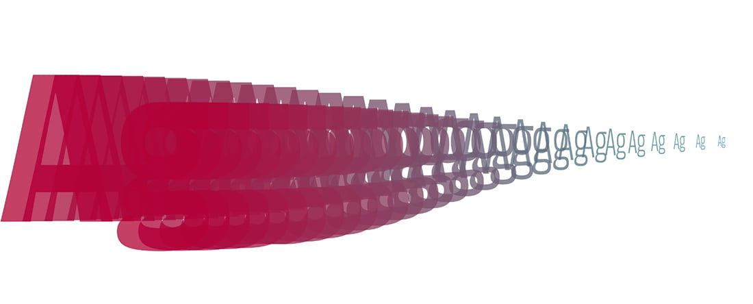
In the simplest of explanations, intrinsic typography loses distinct text styles; rather you define styles based on the proportion of text to the area. The reasons for this are to increase flexibility and write more simple code.
The result is that text “self adjusts” to the container where it lives and isn’t connected to the viewport. You can have a lot more than a handful of preset sizes within a scale that applies to the whole design. The variance becomes almost limitless.
You can try it out using the Typetura tool.
Typography design can be the most important element of any web project. By thinking about how text will render and how it will read at every size, you are creating more valuable and accessible web experiences for all.
It starts with a solid foundation for typography and an understanding of how to adjust for website viewers no matter how they interact with the design.
By: Carrie Cousins
Title: The 2023 Guide to Responsive Typography Sizing and Scales
Sourced From: designshack.net/articles/typography/guide-to-responsive-typography-sizing-and-scales/
Published Date: Tue, 31 Jan 2023 20:00:00 +0000